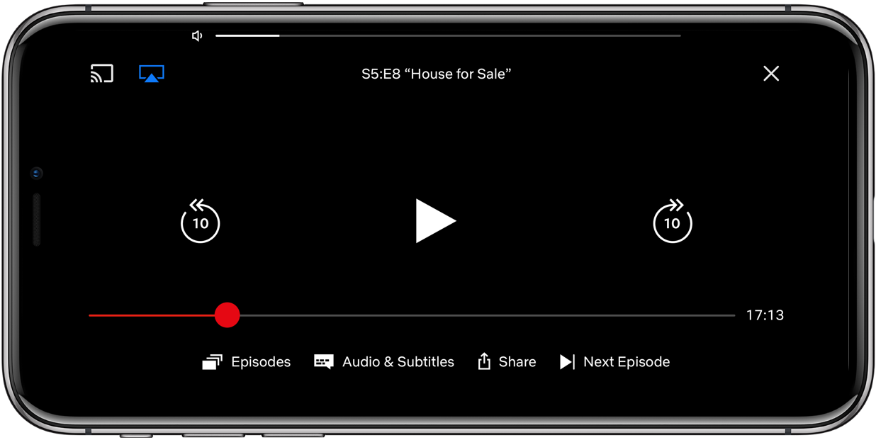
Netflix appears to be testing a new playback interface that includes an unobtrusive YouTube-like volume slider centered at the very top of the interface, along with a few other noteworthy enhancements including the ability to double tap on the right edge of the screen to fast forward 10 seconds and on the left side to rewind 10 seconds.
Functionality of these quick 10-second forward and rewind gestures is replicated by the virtual buttons that have remained part of the app’s playback controls. And just like before, a single tap brings up and hides the video player’s controls and buttons.
As you can see for yourself, 10-second skimming and the new volume slider aren’t the only changes because the video player has a different layout from the old Netflix app.
A few things have been moved around to make them easier to find when watching your favorite movie or TV show. For instance, your controls for casting and AirPlaying along with the “x” for closing the video player have been relocated to the top of the screen.

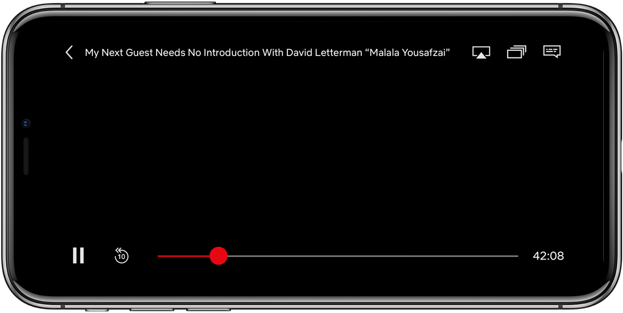
The current playback controls and button layout in Netflix for iPhone
The Play/Pause controls are still in the middle, but the buttons for accessing episodes, subtitles and the Share menu have been relocated to the bottom of the interface.
The refreshed controls and layout are similar to YouTube for iOS, which also has a minimal volume slider and lets you quickly jump forward or back 10 seconds by double tapping either side of the screen. Even Apple has updated iOS’s comically large, square slider—now when you watch fullscreen video, the minimal volume control appears in the top-right corer.
Discovered by Redditor mm2nam, this particular update does not seem to be live yet on App Store for all users globally as the company appears to be either testing the update with a small subset of its user base or rolling the aforementioned changes out on a staggered basis.
Thoughts on Netflix’s overhauled video player?