
Previewed a month ago, Google Maps’ new look began rolling out to iOS users on Wednesday.
Featuring updated colors and styling, Google Maps 4.42 for iPhone and iPad now better highlights the information most relevant to your searches, like gas stations for navigation, train stations for transit and so forth. Google hopes that the updated color scheme, along with the new icons, shall make identifying types of places you’re seeing on the map a lot easier.
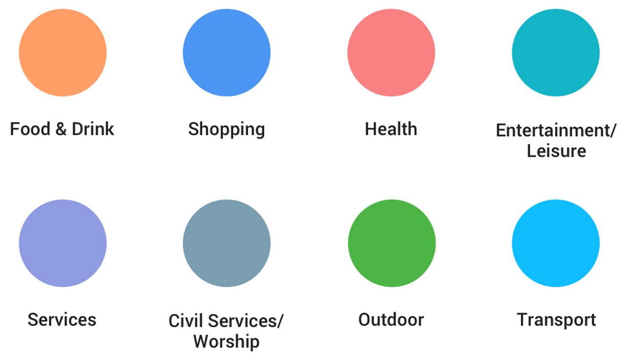
As you can see for yourself, points of interest such as a cafe, church, museum or hospital are now nicely color-coded. This helps you find a coffee shop by spotting the nearest orange icon on the map because orange is the color for the Food & Drink section in Google Maps.
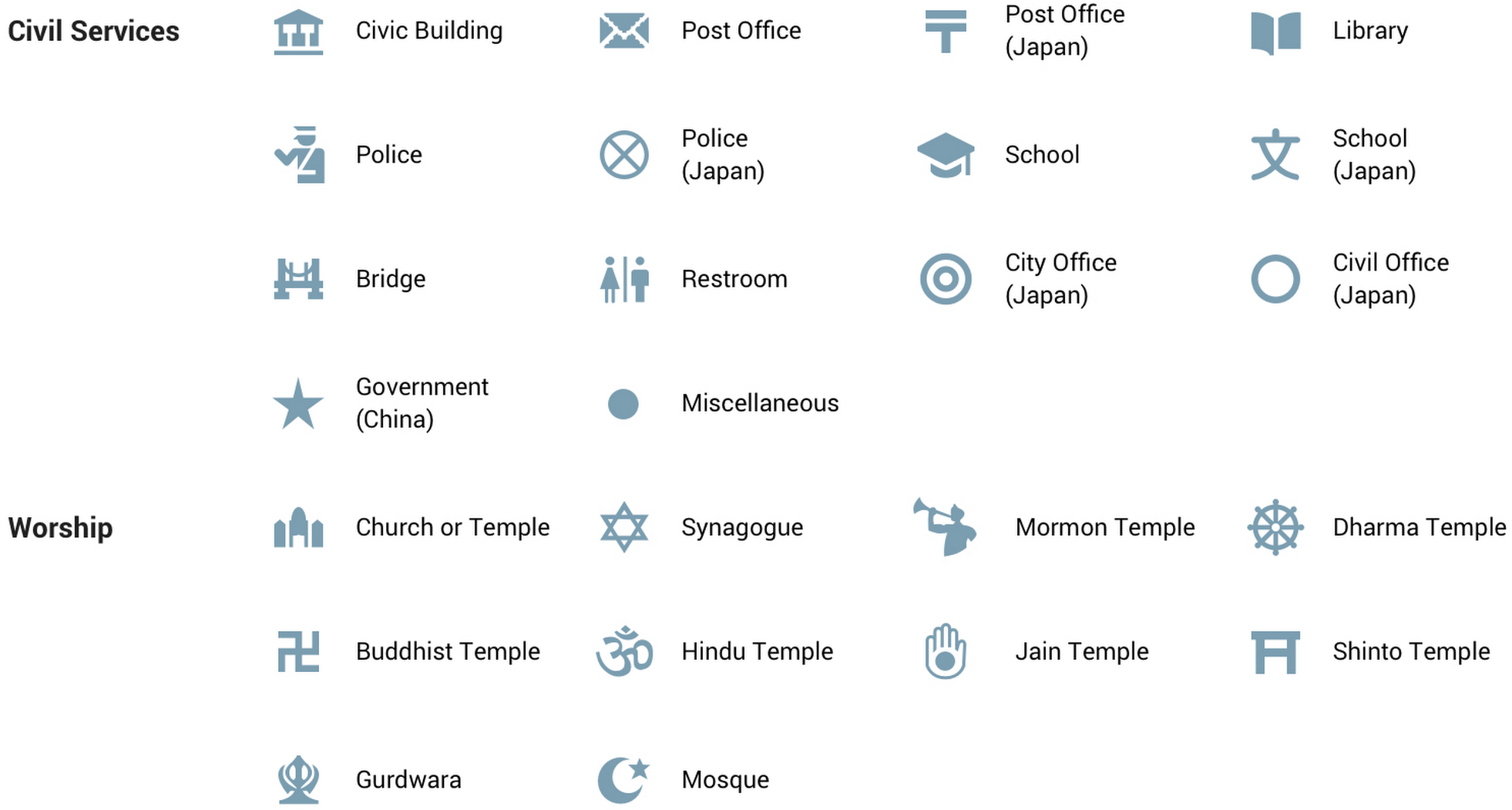
Check out the cheat sheet of the new colors and iconography included below to help you get acquainted with the new look in Google Maps for iOS.
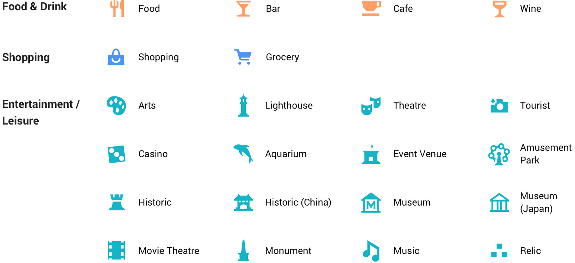
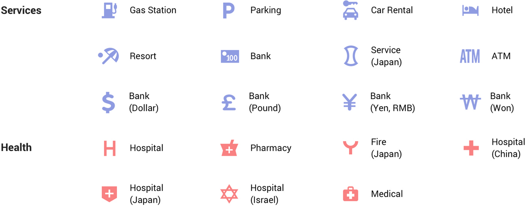
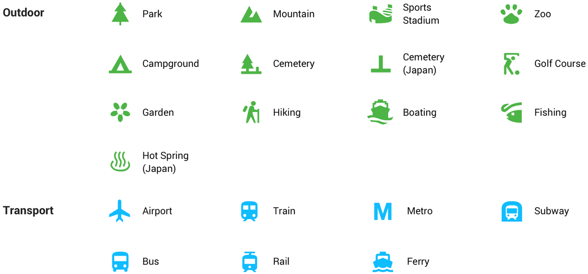

Other changes include an easier way to view the impact of your reviews in the Contributions tab and the ability to filter by trains or buses in the app’s “Transit Departures” Today widget.
These changes require Google Maps for iOS version 4.42 or newer.
Google isn’t stopping there, however, because the updated styling will be applied over the course of the next few weeks to all its products that incorporate mapping features, including Google Assistant, Google Search and Google Earth.
“Over time, the new style will also appear in the apps, websites and experiences offered by companies that use Google Maps APIs as well,” noted the search giant.
And because Santa Claus is coming to town in less than ten days, the firm’s taken it upon itself to come up with a nice Santa’s Village webpage where you can play assorted mini-games, access a wealth of useful resources for teachers and parents, tune into Santa Tracker to follow the big guy and his trusty reindeer as they make their way around the globe, and more.
Pro tip: ask your Google Assistant: “Ok Google, where is Santa?”