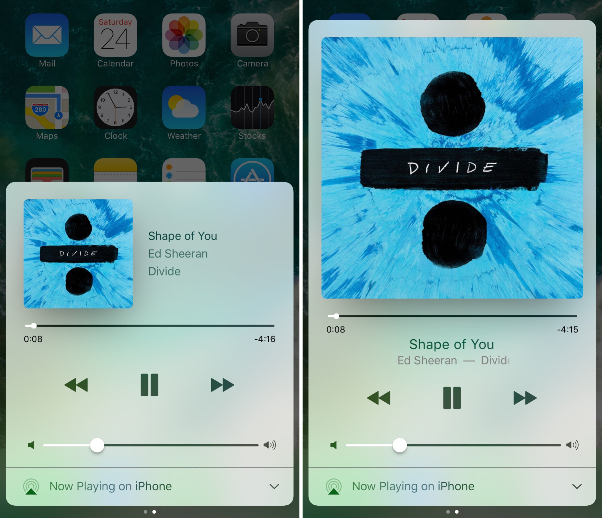
iOS’ Now Playing interface showcases any music you’re listening to and includes controls for adjusting your playback settings, but there are so many ways the interface could be improved.
A new jailbreak tweak called Sinatra by iOS developer candoizo takes some first steps towards improving the Now Playing interface in Control Center while still maintaining an Apple-esque design standard.
The initial change you should notice after installation is how the Now Playing interface now takes up the whole screen rather than just two-thirds of it. With this additional canvas space, the album artwork has been made larger to make it nicer to look at.
To make room for the bigger album artwork illustration, the developer also moved the metadata from the right side of the image to underneath the music scrubber, which keeps a clean non-cluttered look after the fact.
While Sinatra doesn’t come with that many changes, it does support for a bevy of additional jailbreak tweaks that help complement its look, such as:
- Harp
- Horeshoe
- Masq
- Noctis
- And several others…
Although I love the full-screen look Sinatra has to offer, I can’t help but question the price point of the tweak, which is sold in Cydia’s BigBoss repository for $1.99.
With no options to configure, and a limited feature-set, it seems like quite a money-grabber in this circumstance. Hopefully additional updates in the future will add new features to help justify the price tag, nevertheless, the price won’t matter as much to those that like what they see.
Do you like the look and feel of Sinatra over the stock Now Playing interface? Share in the comments section below!