
Many developers are seeing sense in adding dark themes to their warez. Not only do darkened interfaces look stunning, they also help conserve power on iPhones that utilize OLED technology. Having previously explained using black themes in desktop and mobile apps like iMazing, Bear, Outlook.com, Mail, YouTube, Apollo and others, this step-by-step tutorial will now teach you to turn on Wikipedia Dark Mode on iPhone and iPad.
How to enable Wikipedia Dark Mode
Follow the steps below to activate Wikipedia Dark Mode on iPhone or iPad.
1) Open Wikipedia for iOS on your iPhone or iPad.
2) Tap the Explore tab at the bottom.
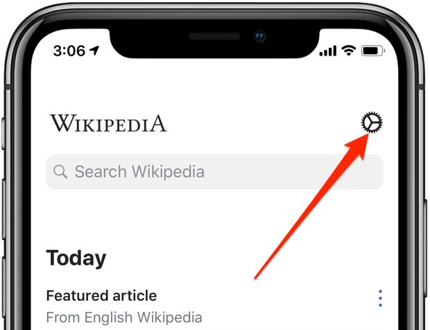
3) Hit the cog wheel icon in the top-right corner to pull up settings.
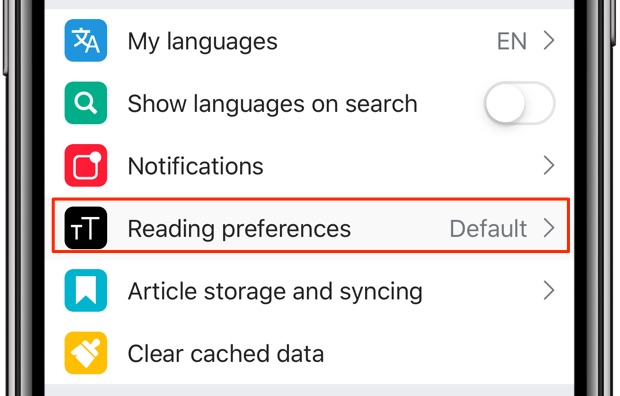
4) Choose Reading Preferences from the list.
5) Now pick a desired look.
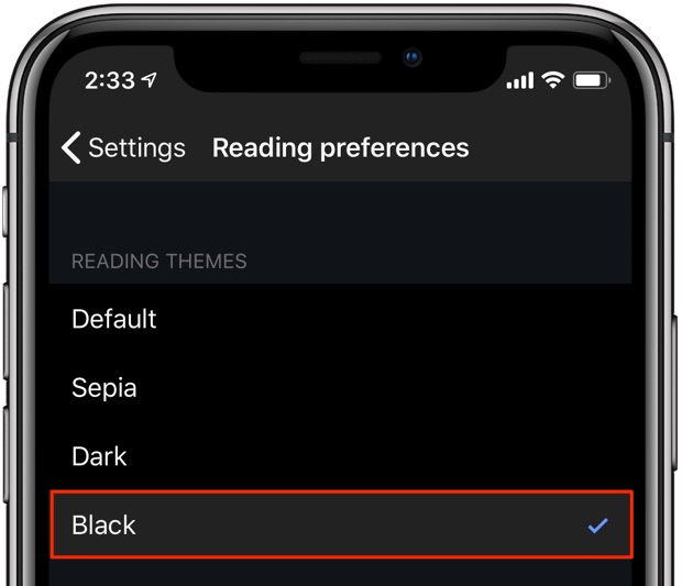
Choose among the following themes listed underneath the Reading Themes heading.
- Default: Uses the white theme, enabled by default.
- Sepia: Switches to a reddish-brown scheme like an old photo.
- Dark: Toggles on a darkened interface.
- Black: Switches to a pure black interface.
Read Wikipedia your way by choosing between the sepia, dark, black and white looks.
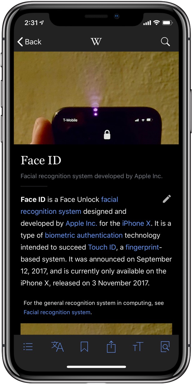
The app includes an image-dimming option which decreases the opacity of images on the Dark and Black themes, making browsing Wikipedia more pleasurable.
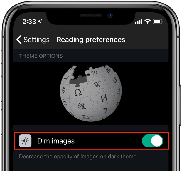
Enable this so images don’t look as harsh when scrolling through Wikipedia entries.
To let you read in full comfort, Wikipedia includes a handy shortcut for changing theme on-the-fly. Tap the “Aa“ button in the tab area at the bottom to access your appearance controls where you can pick a different theme, adjust your text size and increase or decrease brightness.
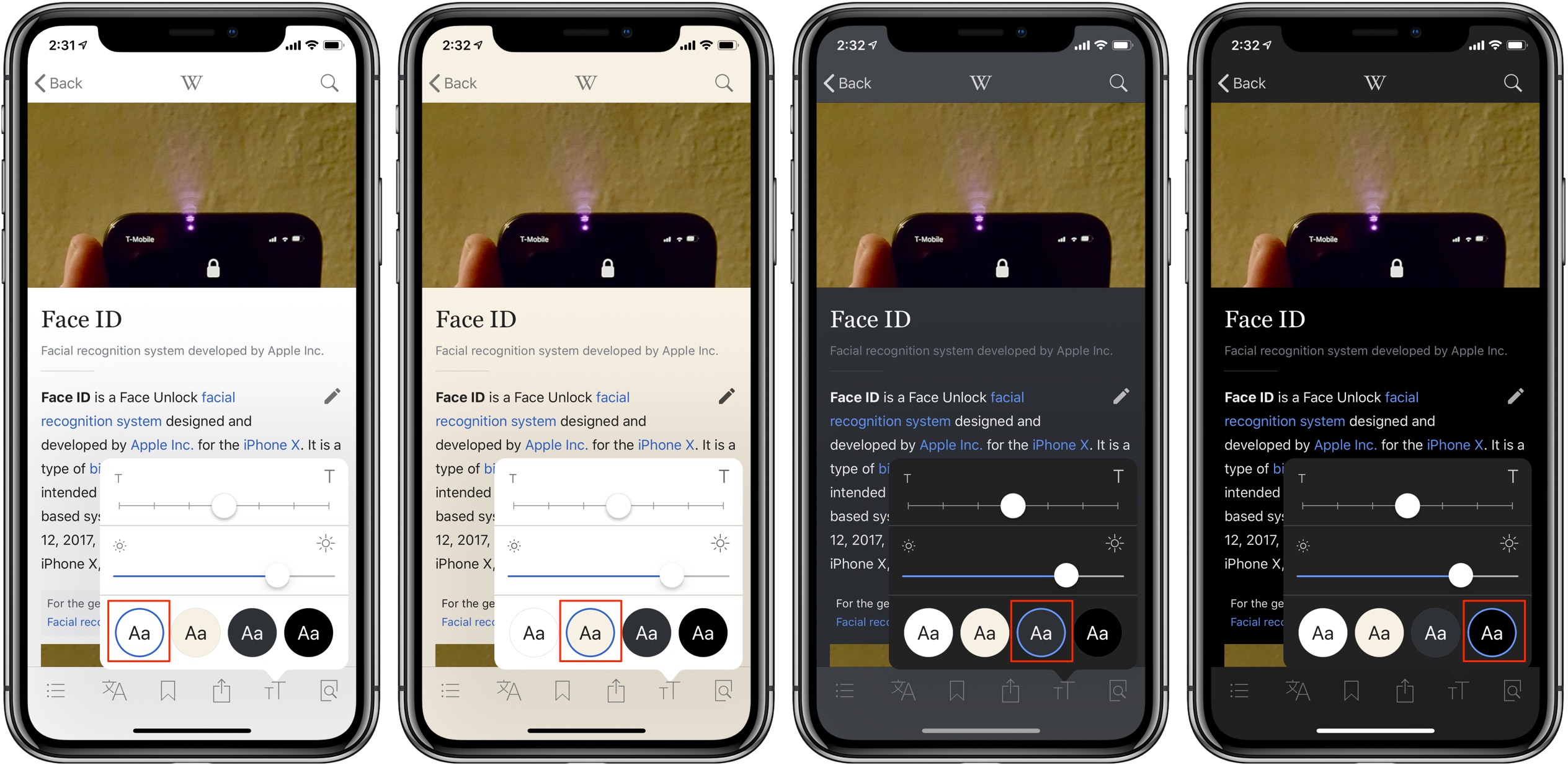
Appearance controls lets you access themes on-the-fly.
Do you browse Wikipedia or read entries mainly in low-light environments, or at night? If so, you’re recommended to use Dark or, better yet, Black theme—your eyes will thank you.
And that, boys and girls, is how you turn on Wikipedia Dark Mode.
Things to know about Dark Mode
Dark Mode is the commonly-accepted phrase that’s mainly used in the technology industry to refer to any user interface theme with predominantly darkened, dark or black elements which combined form a dramatic environment where images and videos “pop”.
Final Cut Pro had a cool dark look years before Dark Mode would become a thing
Dark themes are very popular with creative pros, such as video editors, photographers, designers and so forth. Indeed, glancing at Apple’s pro apps like Final Cut tells you the company’s gone out of its way to create a darkened work environment.
Creative pros prefer a dark UI because it’s way easier on the eyes, especially at night.

Bear’s note-taking app for Mac supports Mojave’s Dark Mode
With macOS Mojave 10.14, Apple is mainstreaming a dark user interface theme and bringing it to the masses who use Mac computers. What Mojave does is bring a system-wide Dark Mode to many of Apple’s stock apps, such as Photos, Notes, Mail, Messages, Calendar and more. Furthermore, Apple is providing an appropriate API to third-party developers who wish to implement darker interfaces in their apps in an officially sanctioned way.
On iOS, Apple is yet to introduce a true Dark Mode.
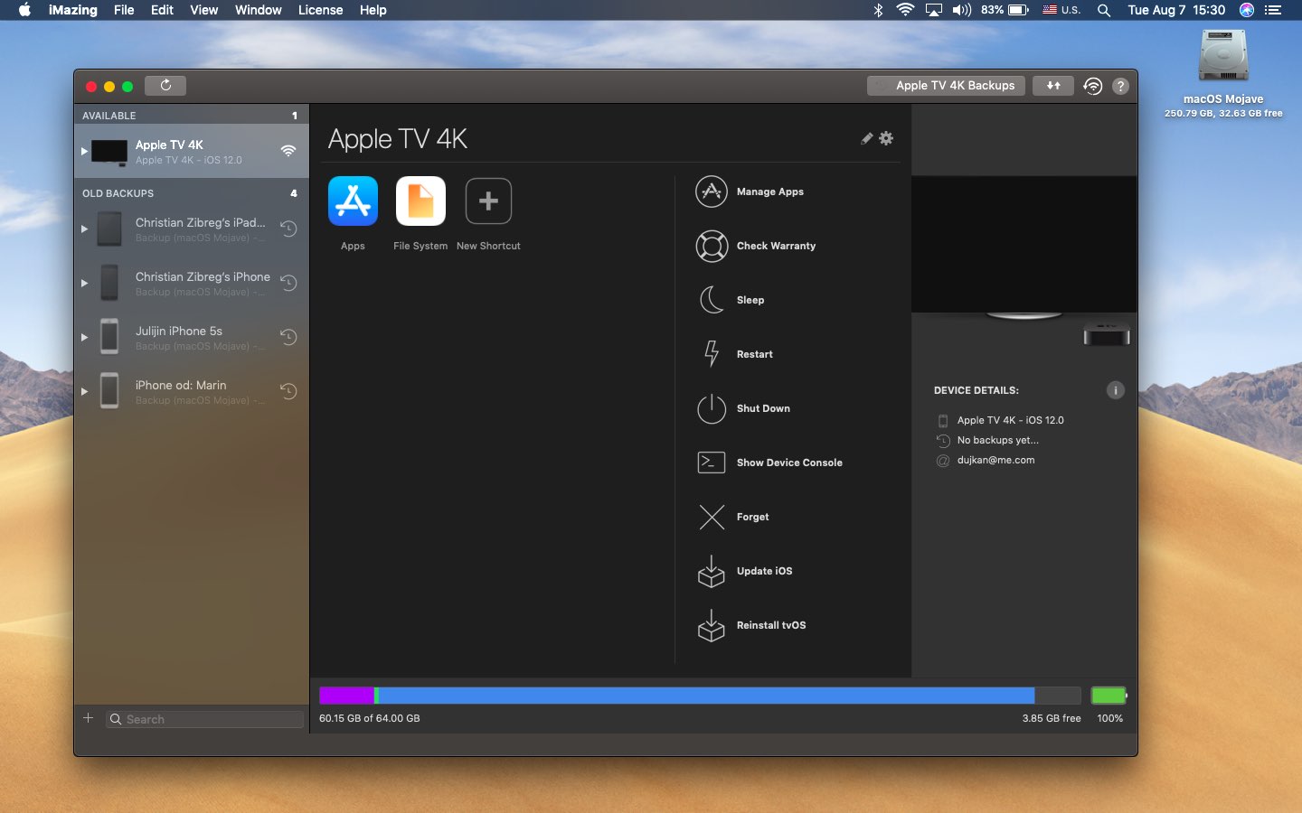
iMazing is one of the first apps to implement Dark Mode using Apple’s APIs
iOS 11 brought an accessibility feature, called Smart Invert, that attempts to create a darkened environment automatically with no effort on the developer’s part, but is fairly limited. iOS 12 hasn’t advanced Smart Invert nor has it brought a system-wide Dark Mode like with Mojave.
Why Dark Mode conserves power on OLEDs
We have no doubt in our mind that Dark Mode will eventually come to iOS simply because it makes a bunch of sense on OLED devices like iPhone X.
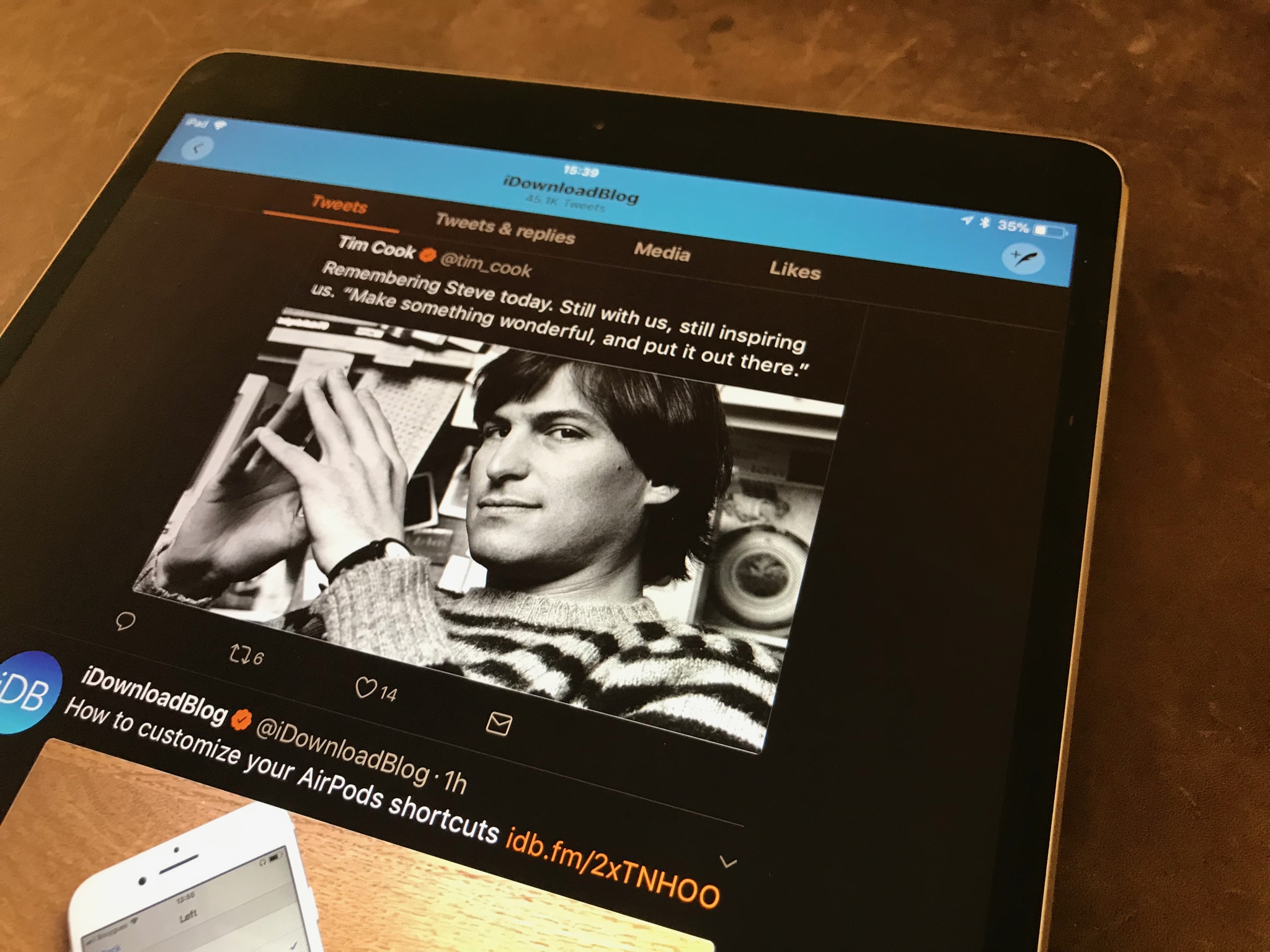
Apps like Twitter and Twitterrific support iOS 11’s Smart Invert with mixed results
This’ll probably happen next year with iOS 13 or in 2020 with iOS 14: by then, the iPhone family will have most likely transitioned to an OLED-only lineup. OLEDs, currently used on iPhone X, do not require a power-hungry backlight module like LCD screens do.
With OLED panels, pixels are lit up individually. If a pixel is black, it’s not consuming any power. Because of these power-sipping characteristics, an OLED screen rendering a mostly black or darkened user interface will conserver more power over a predominantly white user interface.
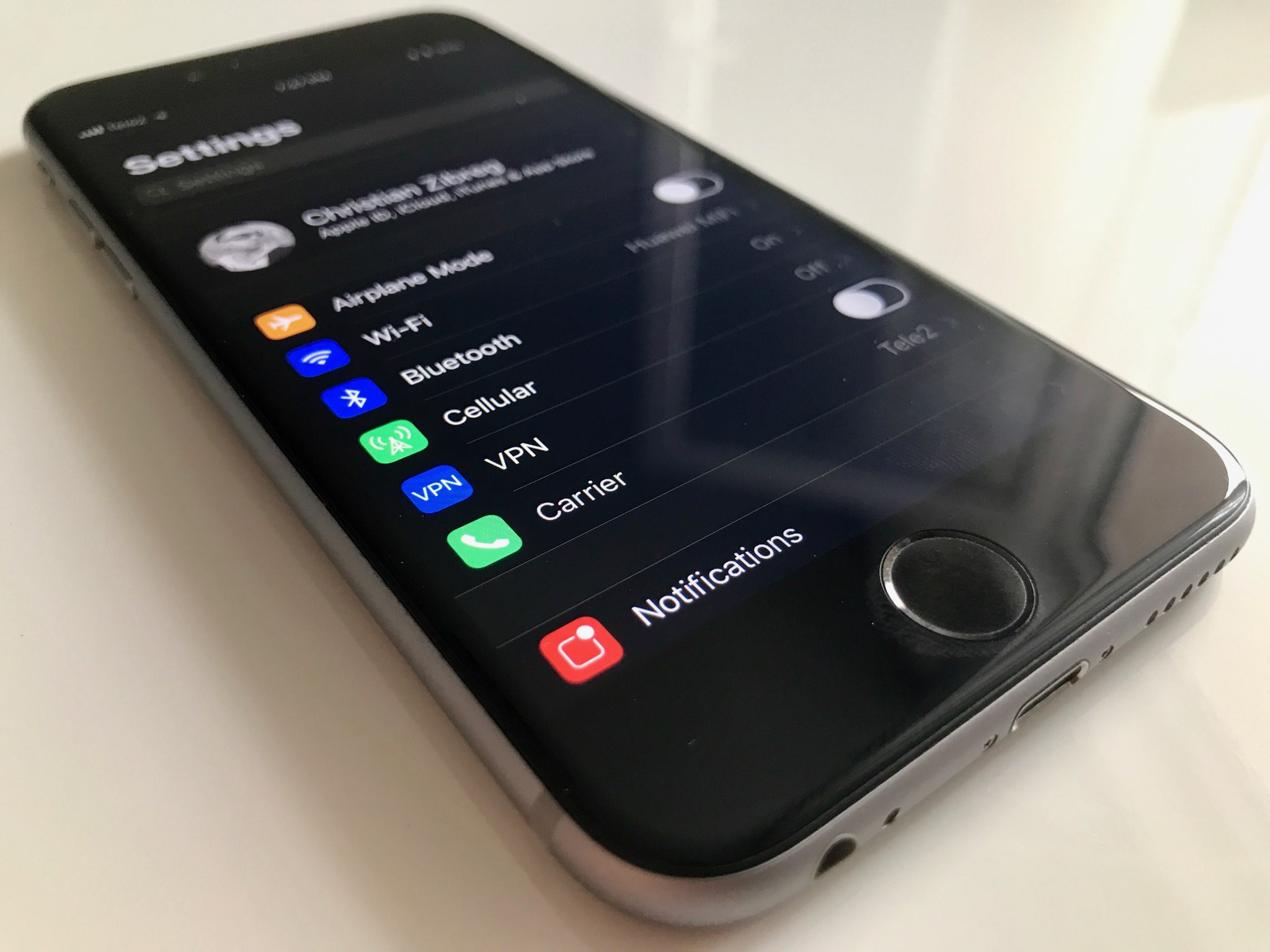
The assistive feature Smart Invert is the closest thing to a system-wideDark Mode on iOS
App Store curates a list of third-party iOS apps that come with a custom black or dark theme.
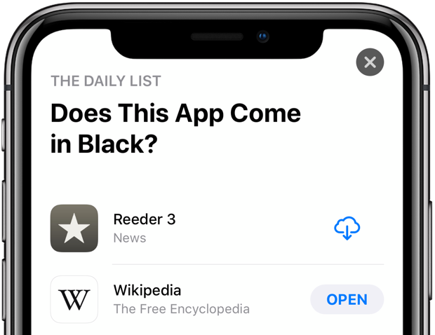
Do yourself a favor and check out the list “Does This App Come in Black?” and see for yourself if some of the most popular iOS apps come with a Dark Mode-like theme.
This curated list is viewable on both the web and in App Store.
