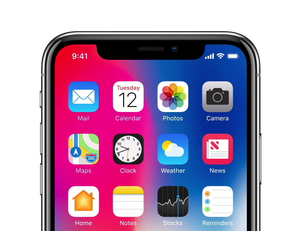
I’m avidly waiting for Apple’s new iPhone X, just like many others, but one of the controversial qualities about the upcoming handset is the ‘notch’ at the top of the display; this is where Apple keeps its TrueDepth camera system and many of the iPhone’s other vital sensors.
Because the iPhone X has a gorgeous edge-to-edge OLED display, I’m thrilled to see how developers will adapt apps to work with the notch. Apple will unquestionably govern for how developers will be allowed to interact with or ‘hide’ the notch, so it should be fascinating to see how creativity will manifest itself.
Landscape mode: Yea or nay?
I think landscape mode will have the most significant impact on how the notch impacts app usability. Developers will either need to space their apps’ text far enough away from the notch that it won’t conflict, or they’ll have to come up with something more innovative.
Apple shows off a lot of landscape mode for games and videos on their website, but not much to the effect of everyday text-based apps, like Contacts, Notes, etc. As an example, here’s a screenshot showcasing a video game scene:
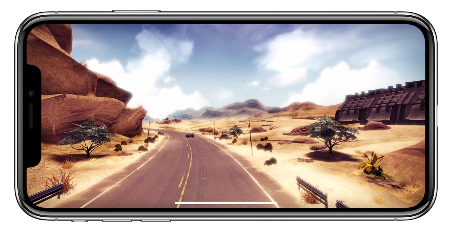
Things really don’t look that bad in this case, and video playback looks next to the same as you see above, but Apple isn’t showing very much real-world landscape use on their website.
Because people don’t know how everything’s going to look from one app to another, this could be the single most significant reason behind all the uncertainty regarding the notch. With that in mind, it’s worth looking at some concepts.
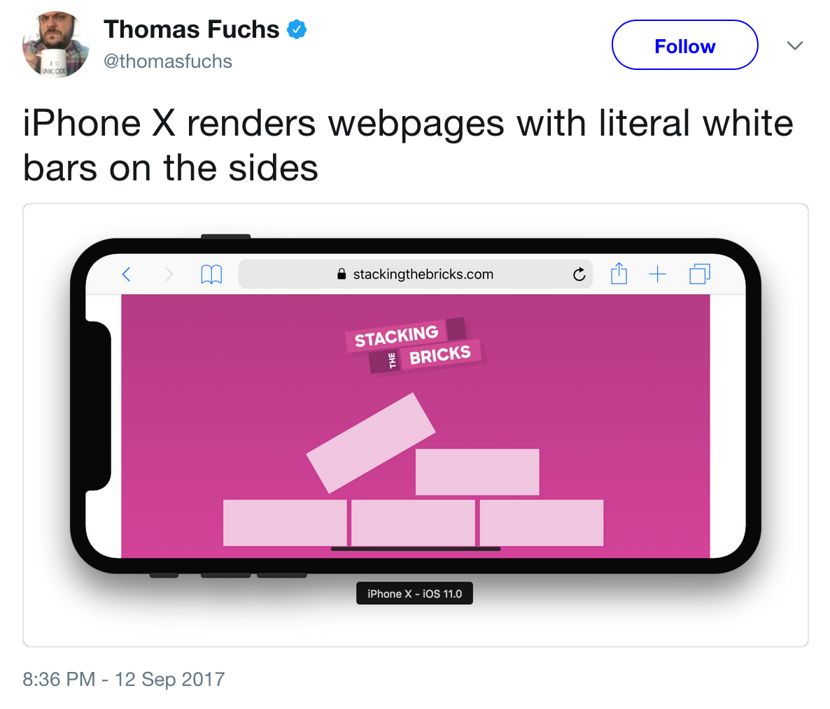
As you can see in the example below, there’s a lot of potential for landscape mode on the iPhone X to be a complete disaster:

Adding more fuel to the fire, web pages viewed in Safari on the iPhone X might be forced to display unsightly white bars on the sides just so the notch doesn’t interfere with web content:
On the other hand, if app developers can utilize the notch in imaginative new ways, then there’s potential to change the negative connotation associated with it. Case in point, this conceptual animation underscores how a fluid scrolling effect can make text-based apps in landscape mode look great whenever the notch is situated on the left side:
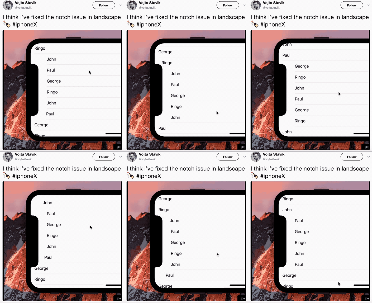
While it’s a little quirkier than most iPhone users are probably used to, the animation seems pleasant to me.
So that brings up another question: The right side of the screen is usually dedicated to the scroll bar, so what if the notch were situated on that side instead? Well, here’s another concept:
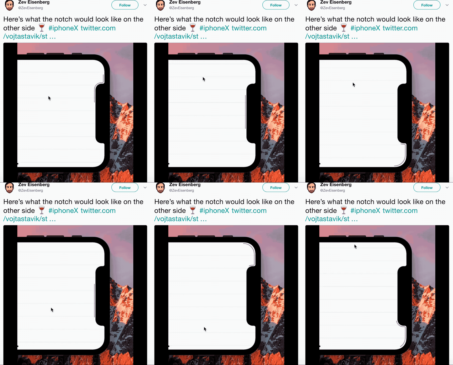
Again, it’s a little more bizarre for those used to rectangular screens, but I still like the concept.
Is the notch a problem for you?
Most of what you’ve seen here is nothing more than artist renditions and concepts and in no way detail Apple’s final plans. On the other hand, the notch remains a controversial part of the iPhone X because it’s ‘different’ from the norm.
One person’s opinion will differ from the next, but while I do think the notch could spark a polarizing experience for existing iPhone users, I’m also ready to embrace the change. For all we know, it could be exciting to see how developers will move forward with the times.
Do you disagree? Share your thoughts about the iPhone X’s notch and how you think it might impact your landscape mode experience in the comments below.